
What Colour Is Taupe – Definition, Hex Code and Uses
Taupe occupies a unique position between grey and brown, offering a sophisticated neutral that adapts to both warm and cool palettes. This brownish-gray tone emerges from mixing grey with brown, creating a muted, earthy aesthetic valued across interior design and fashion industries.
The colour’s ambiguity often sparks debate among designers. While some perceive it as a warm grey, others classify it as a desaturated brown. This chameleon-like quality stems from its specific spectral composition, which positions it at 27 to 28 degrees on the colour wheel.
Understanding taupe requires examining its technical specifications, historical origins, and practical applications. From its French etymology meaning “mole” to its contemporary use in digital interfaces, taupe maintains consistent popularity despite shifting colour trends.
What Colour Is Taupe?
Grayish-brown neutral
#483C32 (standard)
Muted, earthy
Fashion, interiors
- Created by mixing gray with brown pigments, resulting in a desaturated warm neutral
- Described technically as a very dark grayish orange with warm undertones
- Hue angle measures 27.3 to 28 degrees, placing it in the warm-neutral spectrum
- Standard hex code #483C32 represents the most recognised iteration
- Variations range from dark (#342C25) to medium (#54463A) intensities
- Closest web-safe alternative is #333333 for digital applications
- Contains primarily red values with reduced green and blue components
| Aspect | Detail |
|---|---|
| RGB (Standard) | (72, 60, 50) |
| Hex Code | #483C32 |
| RGB Percentage | 28.2% red, 23.5% green, 19.6% blue |
| CMYK | C:0 M:17 Y:30 K:72 |
| HSL Values | 27.3°, 18% saturation, 23.9% lightness |
| Etymology | French for mole |
| Hue Angle | 27-28 degrees |
| Category | Warm-neutral spectrum |
Is Taupe Grey or Brown?
Taupe resists binary classification. The colour sits at the intersection of grey and brown, containing sufficient grey to mute the warmth while retaining enough brown pigment to avoid appearing purely grey.
Warm or Cool Classification
Spectral analysis confirms taupe’s position in the warm-neutral range. Its hue angle of 27 to 28 degrees places it closer to orange than to blue on the colour wheel. Technical specifications identify the standard shade as a very dark grayish orange, distinguishing it from cool greys which typically exceed 200 degrees on the hue spectrum.
Despite these warm undertones, taupe functions as a versatile neutral. In northern light, it may appear cooler and more grey-dominant, while southern exposure emphasises its underlying warmth.
Distinctions from Similar Neutrals
Beige carries more pronounced yellow and tan influences, making it warmer and lighter than taupe. Greige occupies the middle ground between taupe and beige, blending grey with beige rather than brown. Mole, the colour from which taupe derives its name, typically presents darker and more purple-tinted compared to taupe’s orange-brown foundation.
Pure brown lacks the grey component that defines taupe. Colour mixing theory confirms that taupe achieves its distinctive muted quality specifically through the addition of grey to brown bases.
Individual perception of taupe varies significantly based on surrounding colours and lighting conditions. The same taupe wall may appear distinctly brown against grey furnishings while reading as grey against warm wood tones.
Taupe Hex Code and Technical Specs
Digital representation of taupe requires precise hexadecimal values, though no single code defines the colour absolutely. The standard reference point remains #483C32, representing a balanced brown-grey mixture.
Standard Specifications
The hex code #483C32 corresponds to RGB values of (72, 60, 50). Colour analysis reveals this composition creates the characteristic desaturated appearance through limited saturation and moderate lightness levels.
In CMYK colour space, this translates to C:0 M:17 Y:30 K:72, indicating significant black content with moderate yellow and magenta contributions. The absence of cyan distinguishes taupe from cooler grey-brown alternatives.
Shade Variations
Dark taupe, represented by #342C25, shifts toward deeper brown with RGB values of (52, 44, 37). Dark taupe specifications show increased black content while maintaining the essential hue characteristics.
Medium taupe #54463A offers a lighter alternative at (84, 70, 58) RGB values. Design system references often utilise this variation for interface elements requiring greater visibility while retaining the neutral aesthetic.
When implementing taupe in web design, consider #333333 as the closest web-safe alternative if exact colour matching is not required. This substitution maintains the neutral grey-brown appearance across older display systems.
Origins and Usage of Taupe
The term entered English from French, specifically describing the colour of moles. Etymological records trace this association to the natural grey-brown fur of the European mole, establishing a biological reference point for the synthetic colour.
Interior Applications
Interior designers employ taupe as a sophisticated backdrop capable of bridging warm and cool palettes. The colour pairs effectively with natural materials such as stone, wood, and linen. RHS Garden Bridgewater demonstrates taupe’s effectiveness in architectural contexts where neutral tones must harmonise with organic surroundings.
Contemporary spaces utilise taupe to soften minimalist aesthetics without introducing the starkness of pure grey or the rustic associations of beige. Its adaptability suits both traditional and modern environments.
Fashion and Textiles
Fashion houses value taupe as a trans-seasonal neutral. The colour functions as an alternative to black in footwear and accessories, offering softer contrast against skin tones while maintaining professional gravity. Garments in taupe transition between seasons more fluidly than stark whites or deep blacks.
Digital and Interface Design
Design system documentation increasingly includes taupe for interfaces requiring warmth without the yellow cast of beige. The colour supports readability while reducing eye strain associated with pure white backgrounds. Gaming aesthetics demonstrate similar applications where sophisticated palettes replace stark contrasts.
Print and digital representations of taupe vary significantly. CMYK conversions often shift taupe toward purple or green depending on ink calibration. Always verify physical samples before finalising large-scale interior or fashion production.
Understanding Taupe Variations
Despite widespread use, taupe lacks a single authoritative definition. Colour authorities recognise multiple valid interpretations, creating potential confusion for precise applications.
Established Facts
- Standard hex #483C32 is widely accepted
- French origin meaning “mole” is documented
- Hue angle consistently measures 27-28 degrees
- Warm-neutral classification is consensus
- Contains grey-brown mixture
Uncertain or Variable
- Exact boundary between taupe and greige
- Acceptable lightness range varies by industry
- Whether purple-tinted variants qualify
- Distinction from “mole” in specific contexts
- Standardisation across RGB and CMYK conversions
Design Context and Comparisons
Taupe functions as a bridge colour in design systems, connecting warm wood tones with cool metal finishes. Its presence in a palette signals sophistication and restraint, often appearing in luxury branding and editorial design where overt colour statements would distract from content. Magic The Gathering Final Fantasy collaborations demonstrate taupe’s application in gaming aesthetics where fantasy elements meet sophisticated colour theory.
Tint and shade variations expand taupe’s utility. Lighter tints approach greige for airy environments, while deeper shades rival charcoal for dramatic contrast. This range allows monochromatic taupe schemes that avoid visual monotony through subtle value shifts.
Sources and Definitions
Taupe derives from the French word for mole, describing the grey-brown colour of the animal’s fur. The term entered English colour nomenclature during the nineteenth century, bringing with it specific associations with earthy, subterranean tones.
Etymological and colour standard references
The colour is technically classified as a very dark grayish orange, positioned at approximately 27 degrees on the hue wheel. This specific spectral location accounts for its ability to read as either grey or brown depending on contextual surroundings.
Technical colour analysis
Summary
Taupe represents a brownish-gray neutral created by combining grey and brown pigments, technically classified as a dark grayish orange with a hue angle of 27-28 degrees. While standardised at hex #483C32, the colour encompasses a range from dark to medium intensities, serving diverse applications across interior design, fashion, and digital interfaces. Its French etymology connects the colour to the natural world, while its spectral characteristics position it as a warm-neutral capable of bridging cool and warm palettes.
Frequently Asked Questions
What does taupe look like compared to beige?
Taupe appears cooler and more grey-dominant than beige, which carries warmer yellow-tan undertones. While beige suggests sunlight and sand, taupe evokes shadows and earth, creating a more subdued, sophisticated appearance.
Is taupe considered a true neutral?
Yes, taupe functions as a neutral in design contexts, despite possessing warm undertones. It coordinates with both warm and cool colours, though its specific hue angle of 27-28 degrees technically places it in the warm-neutral category.
Where did taupe get its name from?
The name derives from the French word for mole, the small burrowing mammal. The term references the animal’s grey-brown fur colour, which provided the original natural reference for this synthetic pigment mixture.
Can taupe be used effectively in digital interfaces?
Yes, design systems increasingly incorporate taupe for backgrounds and UI elements where pure white causes eye strain or where beige appears too warm. Hex codes such as #483C32 provide the standard digital reference.
What is the closest web-safe colour to taupe?
The closest web-safe alternative to standard taupe is #333333, a dark grey that approximates taupe’s muted, desaturated appearance when exact colour matching is not technically required.
Does taupe appear differently under various lighting conditions?
Absolutely. Northern light emphasises taupe’s grey components, while incandescent lighting brings out its brown warmth. This chameleon-like quality makes sampling essential before committing to large surface applications.
Is mole the same colour as taupe?
While related, mole typically presents darker and with more purple undertones compared to taupe’s orange-brown base. Taupe specifically refers to the lighter, more grey-inflected variations of mole-coloured tones.
How do you mix paint to create taupe?
Mix grey paint with brown pigment, or combine black, white, and orange-brown paints. The key is adding sufficient grey to mute the brown without eliminating its warmth, achieving the characteristic desaturated appearance.
More related posts
 Things to Do in Birmingham – Complete 2025 Guide
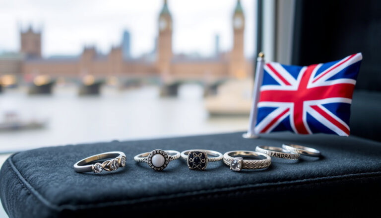 Pandora Rings – Complete UK Buying Guide 2025
 January Jones – Biography, Career, and Personal Life Facts
 Margaret Thatcher – Iron Lady Biography and Legacy
 Martine McCutcheon – Net Worth, Husband, and Life Story in 2025
 What Is Group 7 – Viral TikTok Meme and Trend Explained
 Battle of the Sexes Tennis – Complete History and Results
